10.02.2011
Recycled
This used to be my blog for my design 1 class. My last entry was posted a year and a half ago. But a few days ago, I struck a deal with A, and I am picking up this blog again for a renewed purpose. I'm not so sure about Project 365 (taking and posting a photo a day). I've tried and failed twice already. So for now, this will be an outlet for creative juices, frustration, or whenever inspiration strikes me and I feel like sharing. I hope you have as much fun reading these posts as I do writing them (:
11.22.2009
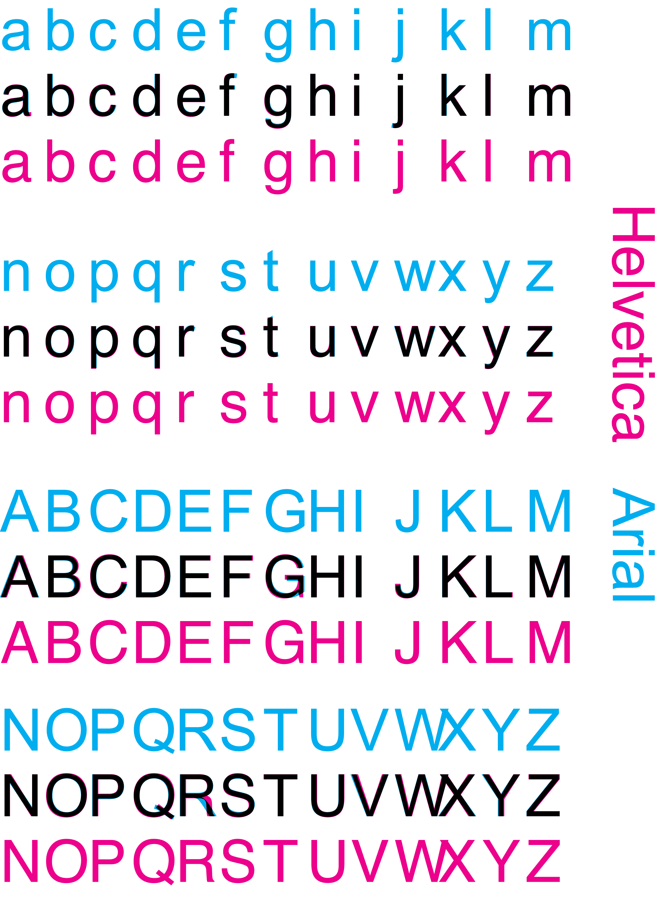
Why Helvetica?

While doing some research when blogging about Gary Hustwit's film, Objectified, I happened to stumble upon a previous documentary of his, Helvetica. After googling it and finding this site, I learned a lot about this universally praised typeface, which was created by Max Miedinger with Edüard Hoffmann in 1957. The movie was released in 2007, the 50th anniversary of said type, and as a font fanatic myself, I casually started doing some research.
One of the most amusing images I happened to stumble across was the one above. I hadn't realized that there was a considerable amount of controversy between Helvetica and Arial in the world of design. At first, I could hardly tell the difference, especially when I saw this image.

image source.
They look nearly identical. However, with the help of this nifty site, I could see just how different the two fonts were. I even took a quiz and scored 19 out of 20! But, just like the creator of this interactive game, it seemed to me that Helvetica was much more preferred over Arial. But why? I dug further.

image source.
Since Helvetica is a default font on Macs, I wondered if it was the same old Apple vs Microsoft kind of deal. Apparently not. Since Helvetica came in a good 25 years ahead of Arial, we must first hail it as the predecessor, although the two fonts are newer versions of two different fonts. Helvetica was designed as a new sans-serif typeface of Akzidenz-Grotesk and Arial was based off of Monotype Grotesque [source].

image source.
However overused and abused Helvetica may have become over the years, its due to its universal appeal that it has ended up in such a way. The reasons why designers are the first to jump up and smother Helvetica with kisses is because the simplicity of the typeface is the perfect neutral platform through which the content of the message can be conveyed [source]. Helvetica made it possible for ads in the 1950s to speak directly to the consumer, without being driven by or imposed through the design [source]. Since then, it has been adopted by countless companies as the font of their logo, revolutionizing our world, whether we consciously realize it or not.
11.20.2009
Originality Is Overrated

After seeing the Wordle created using the text of Nathan Shedroff's book, Design is the Problem, I thought, what the heck. Let's give my blog a shot! After playing around a bit, this is what I got, and for my first Wordle, I'm pretty happy how it turned out.
What I love about Wordle is that it plays around with playing around with words. The size, color, and spacial position of a word in relation to another combine to create unique word clouds. And it's all a matter of chance, because once you edit one aspect of your Wordle, it'll completely rearrange the composition of the size and position of the words. It's such a simple concept too. Making designs out of words? Why not?
It also reminded me of Lou Dorfsman's Gastrotypographicalassemblage. Maybe Jonathan Feinberg found inspiration in the iconic wall. So many inventors and designers value originality, but so many of the best products on the market are reinventions of something old.
Take the iPhone, which is basically an all-in-one phone. It is similar in form to the Newton MessagePad, which was on the market several years before the 21st century. But why do we hear about the iPhone craze, while the MessagePad wasn't anything close to a pop cultural phenomenon? Those Apple designers know how to redesign and suit the ever-changing needs and wants of society [their great advertising doesn't hurt either].
Take the iPhone, which is basically an all-in-one phone. It is similar in form to the Newton MessagePad, which was on the market several years before the 21st century. But why do we hear about the iPhone craze, while the MessagePad wasn't anything close to a pop cultural phenomenon? Those Apple designers know how to redesign and suit the ever-changing needs and wants of society [their great advertising doesn't hurt either].
Other than the light bulb, there aren't many inventions I can think of that don't become better with time. Technology is continually improving, and with that, so are the products of yesterday.
11.18.2009
Can Design Be The Solution?

image source.
The crisp, clean graphics present in Shedroff's slides communicate clearly and serve their purpose within the lecture. The photos he used to illustrate the different kinds of worlds were definitely an eye-opener, portraying the different ways other countries have dealt with problems concerning sustainability and post-consumerism. The comparison he visually made using these images speak for themselves. Even though Cuba might be the most sustainable nation, Shedroff places a heavy emphasis on the word "most," because no nation has achieved complete sustainability. Such a concept seems improbable, with designers pushed by business to continually create for consumers who never say "no." His following slides list design strategies that designers should consider and put into practice when creating, to attain the most sustainable product possible. The four key terms he uses are "Reduce," "Reuse," "Recycle," and "Restore." While most of his slides were self-explanatory, or meant for the reader to interpret, examine, and distinguish on their own, it was ultimately Shedroff's explanations that closed the gap between partial perception and complete comprehension.
For more information, here is Nathan Shedroff's presentation, Design Is The Problem.
11.16.2009
Objectified

Objectified was a truly inspiring film. The featured designers discuss some of the most important aspects about the process of design that seem so obvious in hindsight. One such designer was Dan Formosa, who said, "What we need to do to design is to look at the extremes. The middle will take care of itself." [source:http://www.lukew.com/ff/entry.asp?878] If you think about designing a bike, when both a girl that stands 4'8" tall and a man that stands 6'8" tall can ride it comfortably, it logically follows that just about everyone else who falls in between those two heights will find no problem with such a bike.
The film then continues on to shoot a company's design process in creating a new and improved hand grip for a vegetable peeler, targeted towards easing pain in those with arthritis. After multiple drafts and much trial and error, the design team found that the grip of the handlebar of a bike proved to be the most ergonomic. What was so perplexing about this ingenious discovery lied in its simplicity. The team had found a new purpose for something that already existed.
The film then continues on to shoot a company's design process in creating a new and improved hand grip for a vegetable peeler, targeted towards easing pain in those with arthritis. After multiple drafts and much trial and error, the design team found that the grip of the handlebar of a bike proved to be the most ergonomic. What was so perplexing about this ingenious discovery lied in its simplicity. The team had found a new purpose for something that already existed.
And that's what design is about. It's not always the search for something novel; it's often about returning to an old design and making it better. Sometimes, taking a step forward is just as good as taking a step back.
11.14.2009
My Secret Obsession

But why do I do it? I'm not exactly sure where my origins started. I guess it might have started with my friend Angela, who has amazing photos on her flickr website, some of them of food. She was the first one I saw taking pictures of food, and I quickly caught up. But I guess, in taking photos of my food, I get to see the visually artistic elements of it before I eat it, sushi in particular. Most of the time, these pictures of what I ate will jog more memories of the day than my memory alone can conjure up by itself.
At self-serve frozen yogurt shops, I will often choose my toppings with emphasis on how they will look aesthetically for the photo that I will take of it three minutes later. Which isn't so bad, since I love trying new things. It's an odd way that I have found to express myself.

11.08.2009
Color Optical Illusions

image source.
A frequently used optical illusion is the after-image. Stare at an image for x number of seconds, then look quickly to a blank wall and voilà! You get an entirely different image, which was burned into your retina while you stared so intently at a previous one.
In Josef Albers' Interaction of Color, his explanation of the phenomenon is definitely plausible. Overexposure to one color will fatigue the cones that receive those colors, so the after-image will consist of the complimentary colors of the original image. I know that this is true from experience. When I find myself staring at a vividly red object for a prolonged period of time, I get a green after-image once I look away.
In fact, the text of my blogs may appear white against the black background, but in reality, it's more of a washed out gray. This is white. It's hard to believe that the two colors aren't the same, but once the word "white" has been changed to white, the stark contrast pops out against the sea of now-visible gray.
11.01.2009
A Curtainless Stage
I watched Elephant's Graveyard at the Mondavi Center this afternoon, and not only did I come back with a few more perspectives on the controversies of science and newly-developed technology prolonging our life, or the conflict between placing the elderly in a nursing home or taking care of them at home, but I discovered that a theatrical stage can take many different forms.
Instead of a painted or borrowed backdrop, the stage set for Elephant's Graveyard included mirrors that spanned the entire length of the wall, which gave the room the illusion of size and the impression of an airy, open environment. They also provided a mirror image of the actors, which could be seen simultaneously with the actors in real time. Curved stairs that led to the upper right corner of the set were perfect for portraying Esme's ascent to the next life, and an effective way to separate and direct the audience's attention to the singer from the scene on the stage. The musicians playing live music off to the right corner next to the stage engaged the audience more than a prerecording could have.
Instead of a painted or borrowed backdrop, the stage set for Elephant's Graveyard included mirrors that spanned the entire length of the wall, which gave the room the illusion of size and the impression of an airy, open environment. They also provided a mirror image of the actors, which could be seen simultaneously with the actors in real time. Curved stairs that led to the upper right corner of the set were perfect for portraying Esme's ascent to the next life, and an effective way to separate and direct the audience's attention to the singer from the scene on the stage. The musicians playing live music off to the right corner next to the stage engaged the audience more than a prerecording could have.
The only drawback with the lack of traditional curtains and wings is that the scene changes, entrances and exits, and stagehand were quite visible. But the thing with art is that it adapts and changes to give us different experiences every once in a while. That's exactly what Elephant's Graveyard was about: the set was a work of art in itself.
Subscribe to:
Posts (Atom)