11.22.2009

Why Helvetica?


image source.


While doing some research when blogging about Gary Hustwit's film, Objectified, I happened to stumble upon a previous documentary of his, Helvetica. After googling it and finding this site, I learned a lot about this universally praised typeface, which was created by Max Miedinger with Edüard Hoffmann in 1957. The movie was released in 2007, the 50th anniversary of said type, and as a font fanatic myself, I casually started doing some research.

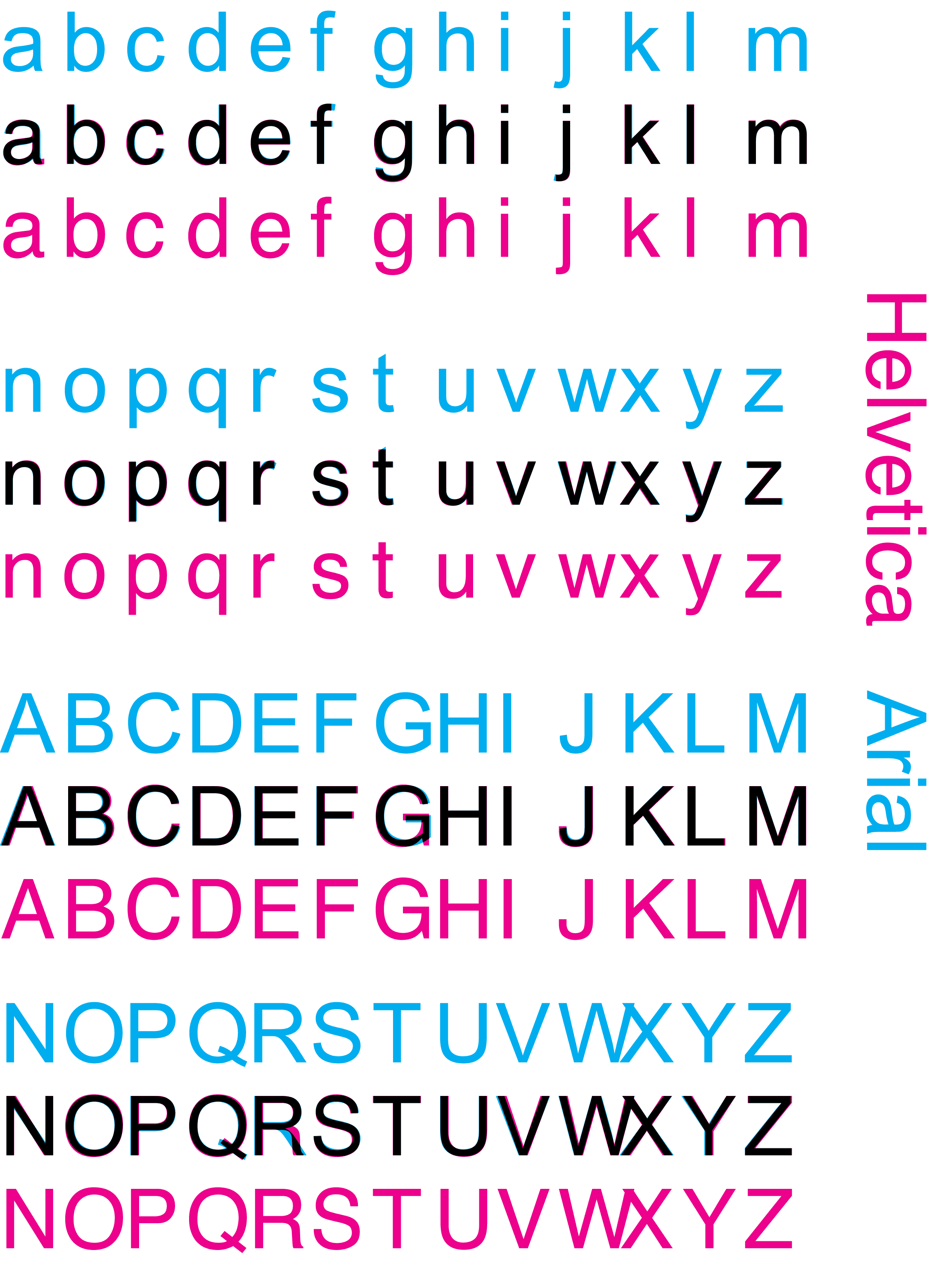
One of the most amusing images I happened to stumble across was the one above. I hadn't realized that there was a considerable amount of controversy between Helvetica and Arial in the world of design. At first, I could hardly tell the difference, especially when I saw this image.


image source.


They look nearly identical. However, with the help of this nifty site, I could see just how different the two fonts were. I even took a quiz and scored 19 out of 20! But, just like the creator of this interactive game, it seemed to me that Helvetica was much more preferred over Arial. But why? I dug further.


image source.


Since Helvetica is a default font on Macs, I wondered if it was the same old Apple vs Microsoft kind of deal. Apparently not. Since Helvetica came in a good 25 years ahead of Arial, we must first hail it as the predecessor, although the two fonts are newer versions of two different fonts. Helvetica was designed as a new sans-serif typeface of Akzidenz-Grotesk and Arial was based off of Monotype Grotesque [source].


image source.


However overused and abused Helvetica may have become over the years, its due to its universal appeal that it has ended up in such a way. The reasons why designers are the first to jump up and smother Helvetica with kisses is because the simplicity of the typeface is the perfect neutral platform through which the content of the message can be conveyed [source]. Helvetica made it possible for ads in the 1950s to speak directly to the consumer, without being driven by or imposed through the design [source]. Since then, it has been adopted by countless companies as the font of their logo, revolutionizing our world, whether we consciously realize it or not.

11.20.2009

Originality Is Overrated


image source.


After seeing the Wordle created using the text of Nathan Shedroff's book, Design is the Problem, I thought, what the heck. Let's give my blog a shot! After playing around a bit, this is what I got, and for my first Wordle, I'm pretty happy how it turned out.

What I love about Wordle is that it plays around with playing around with words. The size, color, and spacial position of a word in relation to another combine to create unique word clouds. And it's all a matter of chance, because once you edit one aspect of your Wordle, it'll completely rearrange the composition of the size and position of the words. It's such a simple concept too. Making designs out of words? Why not?

It also reminded me of Lou Dorfsman's Gastrotypographicalassemblage. Maybe Jonathan Feinberg found inspiration in the iconic wall. So many inventors and designers value originality, but so many of the best products on the market are reinventions of something old.

Take the iPhone, which is basically an all-in-one phone. It is similar in form to the Newton MessagePad, which was on the market several years before the 21st century. But why do we hear about the iPhone craze, while the MessagePad wasn't anything close to a pop cultural phenomenon? Those Apple designers know how to redesign and suit the ever-changing needs and wants of society [their great advertising doesn't hurt either].

Other than the light bulb, there aren't many inventions I can think of that don't become better with time. Technology is continually improving, and with that, so are the products of yesterday.

11.18.2009

Can Design Be The Solution?


image source.


I didn't realize what an honor it was to have Nathan Shedroff as a guest speaker for our lecture yesterday until one of the coordinators rambled on continuously for a few minutes of his accomplishments, published books, and honors. His presentation was entertaining, insightful, thought-provoking, and witty. After his hour-long lecture, I was left with a much better understanding of how the instinctual selfish nature of humans has caused many of the global problems we are currently battling.

The crisp, clean graphics present in Shedroff's slides communicate clearly and serve their purpose within the lecture. The photos he used to illustrate the different kinds of worlds were definitely an eye-opener, portraying the different ways other countries have dealt with problems concerning sustainability and post-consumerism. The comparison he visually made using these images speak for themselves. Even though Cuba might be the most sustainable nation, Shedroff places a heavy emphasis on the word "most," because no nation has achieved complete sustainability. Such a concept seems improbable, with designers pushed by business to continually create for consumers who never say "no." His following slides list design strategies that designers should consider and put into practice when creating, to attain the most sustainable product possible. The four key terms he uses are "Reduce," "Reuse," "Recycle," and "Restore." While most of his slides were self-explanatory, or meant for the reader to interpret, examine, and distinguish on their own, it was ultimately Shedroff's explanations that closed the gap between partial perception and complete comprehension.

For more information, here is Nathan Shedroff's presentation, Design Is The Problem.

11.16.2009

Objectified


image source.


Objectified was a truly inspiring film. The featured designers discuss some of the most important aspects about the process of design that seem so obvious in hindsight. One such designer was Dan Formosa, who said, "What we need to do to design is to look at the extremes. The middle will take care of itself." [source:http://www.lukew.com/ff/entry.asp?878] If you think about designing a bike, when both a girl that stands 4'8" tall and a man that stands 6'8" tall can ride it comfortably, it logically follows that just about everyone else who falls in between those two heights will find no problem with such a bike.

The film then continues on to shoot a company's design process in creating a new and improved hand grip for a vegetable peeler, targeted towards easing pain in those with arthritis. After multiple drafts and much trial and error, the design team found that the grip of the handlebar of a bike proved to be the most ergonomic. What was so perplexing about this ingenious discovery lied in its simplicity. The team had found a new purpose for something that already existed.

And that's what design is about. It's not always the search for something novel; it's often about returning to an old design and making it better. Sometimes, taking a step forward is just as good as taking a step back.

11.14.2009

My Secret Obsession


Everyone, my friends, my family, and even the occasional neighboring diner, notices my signature trait whenever I eat out: I like taking photos of my food. Some find it weird or annoying ["Just eat your food already!"], other times they find it amusing. One guy thought I was some food critic [thanks for the compliment].

But why do I do it? I'm not exactly sure where my origins started. I guess it might have started with my friend Angela, who has amazing photos on her flickr website, some of them of food. She was the first one I saw taking pictures of food, and I quickly caught up. But I guess, in taking photos of my food, I get to see the visually artistic elements of it before I eat it, sushi in particular. Most of the time, these pictures of what I ate will jog more memories of the day than my memory alone can conjure up by itself.

At self-serve frozen yogurt shops, I will often choose my toppings with emphasis on how they will look aesthetically for the photo that I will take of it three minutes later. Which isn't so bad, since I love trying new things. It's an odd way that I have found to express myself.


11.08.2009

Color Optical Illusions

image source.


A frequently used optical illusion is the after-image. Stare at an image for x number of seconds, then look quickly to a blank wall and voilà! You get an entirely different image, which was burned into your retina while you stared so intently at a previous one.

In Josef Albers' Interaction of Color, his explanation of the phenomenon is definitely plausible. Overexposure to one color will fatigue the cones that receive those colors, so the after-image will consist of the complimentary colors of the original image. I know that this is true from experience. When I find myself staring at a vividly red object for a prolonged period of time, I get a green after-image once I look away.

One other interesting concepts in Josef Albers' Interaction of Color is subtraction of color. At first glance, the center squares in plate VII-4 on page 89 look almost the same, but when the background color is taken away, the differences are drastic. The two colors aren't even of the same shade or hue at all, but the fact that the contrasting ground colors were able to make a tannish yellow appear similar to a mossy green is nothing short of amazing.

In fact, the text of my blogs may appear white against the black background, but in reality, it's more of a washed out gray. This is white. It's hard to believe that the two colors aren't the same, but once the word "white" has been changed to white, the stark contrast pops out against the sea of now-visible gray.

11.01.2009

A Curtainless Stage

I watched Elephant's Graveyard at the Mondavi Center this afternoon, and not only did I come back with a few more perspectives on the controversies of science and newly-developed technology prolonging our life, or the conflict between placing the elderly in a nursing home or taking care of them at home, but I discovered that a theatrical stage can take many different forms.

Instead of a painted or borrowed backdrop, the stage set for Elephant's Graveyard included mirrors that spanned the entire length of the wall, which gave the room the illusion of size and the impression of an airy, open environment. They also provided a mirror image of the actors, which could be seen simultaneously with the actors in real time. Curved stairs that led to the upper right corner of the set were perfect for portraying Esme's ascent to the next life, and an effective way to separate and direct the audience's attention to the singer from the scene on the stage. The musicians playing live music off to the right corner next to the stage engaged the audience more than a prerecording could have.

The only drawback with the lack of traditional curtains and wings is that the scene changes, entrances and exits, and stagehand were quite visible. But the thing with art is that it adapts and changes to give us different experiences every once in a while. That's exactly what Elephant's Graveyard was about: the set was a work of art in itself.

10.30.2009

Steve's Popcorn Quilt


When I visited the African Quilt exhibition at the Nelson Gallery in the Art Building, I wasn't sure what to expect. At first glance, there didn't seem to be anything particularly special about these quilts other than their somewhat daunting size, but once I took a step closer to look at the amazing array of colors and the intricate details, I could tell these weren't just another bed warmer.

Steve's Popcorn Quilt was one of the most interesting quilts because it didn't look like one. Yes, it's made of hundreds of patches sewn together, but it isn't even close to the traditional quilt with cotton batting. What's even more amazing and jaw-dropping about this quilt is that it was made in the late 1800s, which meant colored and patterned cloth weren't easy to find. This is a quilt one would expect to have been created, at the earliest, sometime in the mid-1900s.

The individual popcorn-like patches are all the same shape and size, which give the quilt a general sense of pattern. However, none of the twenty four-by-four boxes consist of the same order of patterned cloth. If one looks at the quilt from afar, the randomly-ordered boxes of colored patches are no longer evident; instead, they are unified by a solid grid layout of lavender-colored patches.

10.29.2009

Visit from HappySlip

[I really wish I had a photo to document Christine Gambito / HappySlip stopping by at our lecture, but I was lame and forgot my camera.]


Having Christine Gambito, also known as HappySlip from YouTube, stop by our lecture on Wednesday was, first and foremost, such a priceless experience. She's a YouTube star! But she, humble that she is, still found the time to come to talk to us about how and why she does what she does.

Christine talked about finding inspiration within her family, as well as from other videos. That goes to show that even the best of the best, or in this case, one of the funniest people on YouTube, don’t come up with all their material on their own. She knows how to tell a story and she knows how to make her audience laugh, but without hilarious family scenarios to reenact or a ridiculous security alarm system ad on TV to make fun of, she wouldn’t have anything to share with her fans.

She also addressed the issue of females being more prone to compare, and I can relate to that on multiple levels. If she finds herself over comparing her videos with others, she stops watching; when I find myself over comparing next time, I can’t just turn off my thoughts, but I will find something more positive to think about.

While I wasn’t exactly starstruck to the point of hyperventilation, the whole thing did strike me as surreal. All my friends were jealous when I told them HappySlip not only came to my Design lecture, but also took a picture with me after. I definitely learned more about the creative process that design is a part of in every different kind of media.

10.27.2009

Bum, Bum, You've Been Here Before


This sculpture has been consciously or unconsciously seen by every student that goes to UC Davis. At eleven feet tall, it is an impressive mass of cast aluminum and bronze, and quite hard to miss as well. Bum, Bum, You’ve Been Here Before was created in 1967 by Tio Giambruni, who taught in the Department of Art here at UC Davis from 1961 until his death in 1971.

What makes this sculpture so captivating is the fact that it encompasses an ironic concept: industrial elegance. The pipe-like structures curve to create a beautiful and flowing rhythm throughout the figure.

The vertically standing pipe in the center of the sculpture, well over five feet above the rest, is the emphasis of this piece. The pipes extending on either side help balance the standing portion of the sculpture.

If the pipes were any narrower, the sculpture would seem empty, with more negative space occupying the center. However, if they were any wider, the graceful curvatures and flowing turns of the sculpture would no longer be visible, lost in the width of the pipes. With proportions of this scale, the pipes are the perfect width in portraying the ironic beauty of modern industry.

10.25.2009

Potsticker Trial and Error


I'm not known for my culinary skills, but I do know my way around the kitchen, and I usually don't burn anything. That being said, I was quite a bit surprised when my first batch of potstickers turned out to literally stick to the pan I was frying them in.
I’ve watched my parents cooking them back at home, and they never clung for dear life to the bottom of the pan. I added enough water, I used enough oil, and I was watching over them the entire time. I was frustrated.

My friend whose pan I borrowed then added that her pan wasn’t nonstick. Ah, that was a big problem. I then sought to borrow one from student housing. After going through the same process with a second batch, borrowing a glass lid, adding more oil than necessary and standing next to the stove for the entire half hour, I was impressed. The potstickers were cooked thoroughly, slid off the pan easily, and the bottoms were fried to a perfect golden-brown.

These beat those of my parents’ and even my brother’s; never had I eaten potstickers with as much crunch as that second batch. Of course, I added more oil in fear that they would stick to the bottom of the pan again, but they certainly tasted better that way.

I was glad I learned from just one trial. Sometimes, it has nothing to do with the artist. You may be using the wrong utensils. Other times, you need to use different ingredients or adjust your recipe. But every time you have fallen short of expectations, you should always get up and consider what went wrong.


10.22.2009

The Hello Kitty Appeal


I doubt anyone doesn't know who Hello Kitty is. Everyone knows her; if not for her irresistible charm, then for her gag-inducing cuteness.

But why is her appeal so universal? Why is it Hello Kitty that may be the only thing in common between a girl in third grade and a woman well into her thirties? What is the secret to the success of the big-headed, bow-sporting, mouthless white cat?

The lack of a mouth is one of her most defining characteristics, and Sanrio’s best marketing strategy. According to Ken Belson and Brian Bremner, co-authors of
Hello Kitty: The Remarkable Story of Sanrio and the Billion Dollar Feline Phenomenon, “The cat has no mouth, and this represents a major source of emotional association for buyers, as they can project many different feelings onto the little cat.” [source: http://answers.google.com/answers/threadview/id/281259.html] The original designer, Ikuko Shimizu, had created her so because she “speaks from the heart,” [source: http://sites.google.com/site/hellokittyoh8/howdidhellokittygettobethehellokittywekn] but whether accidental or intentional, omitting a mouth from the design has definitely made a significant contribution to the now multi-billion market of Hello Kitty.

Her simple face is easily recognizable, and adaptable for different lines of products. What started off as mostly stationery, school supplies, and accessories targeted at pre-teen girls has expanded to include every product imaginable aimed at females of all ages, with expensive jewelry and a makeup line reigning in the celebrities and adolescents.

Celebrating her thirty-fifth birthday this year, Hello Kitty is only gaining more popularity. A universally-appealing phenomenon is hard to come by; one that has lasted for over three decades and shows no signs of stopping? That’s Hello Kitty.

10.14.2009

The Bee


My friend and I decided to visit Berkeley this summer to audit lectures before college and to visit a friend who was taking classes. As I walked out of one lecture hall, I spotted a bee hovering above a bush, zipping back and forth between flowers. I waited for the preoccupied bee to land before taking the photo. I thought nothing of it then, other than a photo that captured an intimate moment in nature between two interdependent species, but I now find that it portrays the role between the designer and society in a number of ways.

Just like the bee that flies from flower to flower to draw nectar and, ultimately, to make honey, an artist draws inspiration from different works of art to create a single masterpiece. Even the greatest artists that ever lived drew inspiration from sources outside themselves, one predominantly more often than the rest: nature. The flowers can also represent the different people an artist keeps in mind as he or she designs. Every time the bee lands, it leaves behind a slightly different blend of pollen from the previous landing as it picks up a new variation, like the artist that adds fresh ideas to his palette with each project he slaves away for, altering his approach or picking up techniques used by other artists, gaining experience and stray bits of wisdom along the road.

The relationship between the bee and the flower is one that must be mutual. The bee gathers nectar from the flower, but in return, it helps pollinate the flower. An artist would be nothing if the audience neither criticized nor praised. The audience, on the other hand, wouldn’t care for the artist’s work if it was too abstract to comprehend. Both the artist and the audience must reach an equilibrium in which one side benefits as much as the other.

10.13.2009

Stone Soup


The first time I participated in anything close to the Stone Soup activity I had in my design class on Monday was on Monday. I’ve completed projects in which the materials are recycled, but Stone Soup was different from those projects on one fundamental part: we could create
anything. The resulting product didn’t have to represent anything. And unlike previous projects, the process was just as important as the product.

Our group of six worked well; together from the beginning to the end. We laid a ripped up paper bag flat for our canvas and decided to use three colorful CDs one girl had brought as the centerpieces. It was agreed early on that this was going to be a mobile of sorts, a collage with moving, dangling pieces. A lot of string was used to hang objects, leaves picked up off the ground were added to the collage, and glue was used as an adhesive, as well as a decorative garnish.

While I loved that our group chemistry was collaborative and pleasant, there wasn’t enough communication. We had a central idea and each person added their own touch and interpretation, which were great by themselves but a jumble of a mess when everything was put together in the end. I can see why designers, as Max Azria puts it, “need to be team players.” The key to a great design is communication; communication within the design team, communication to the consumer.

In my honest opinion, the individual elements of the mobile were more aesthetically pleasing than the product as a whole. Our mobile had no shape or form or foundation upon which it was built. There were too many different things going on at once, but of course, the point of the project was to be abstract, not to create a representation of something. That’s exactly what we did.

10.12.2009

Haha Hoho vs Huh Huk


When I visited the Design Museum on Sunday, I was immediately drawn to this pair of digital prints hung side by side. The two canvases are exactly the same in dimension, shade of pure snow white, and use of the hieut character, encased by the same thin, black frame. The similarities end there.

The pring on the left, titled Haha Hoho, sounds just like the emotions it is meant to express. Bursting with the vibrant colors of bright green, brilliant magenta, and neon orange, one can feel the explosion of laughter, joy, and happiness emanating from the canvas. the curvature of strokes resembles, as artist Hyunju Lee stated, "the shape of an ebullient smile."

The print on the right, titled Huh Huk, is a slate gray, dark blue, and pine green composition of straight lines with hieut characters scattered sparsely among the dull-colored stripes. The flat, straight lines coupled with the somber colors convey a grave and serious mood, or perhaps the gloominess of a rainy day. Lee entitled this piece so since it bears resemblance to "the Korean sound of sobbing," although it pretty much sounds like the universal sound of sobbing.

What especially makes this duo so irresistible to gaze at is that they are juxtaposed in such a way as to make them stand out more, in comparison to each other. Haha Hoho, overflowing with overlapping hieut characters crowding over the lines looks like a tropical rain forest densely populated with life, whereas in Huh Huk, each individual hieut character stands alone, a barren, snow-covered forest in the taiga.

10.11.2009

Typographic Expoloration in Hangul


I went to visit the current exhibition featured in the UC Davis Design Museum, Typographic Exploration in Hangul, with a friend of mine this afternoon. After a good half hour photographing just about everything hung out for display, I have to say, it was one of the most awe-inspiring and jaw-dropping exhibits I have ever been to, and I have seen my fair share of galleries and museums. This portfolio of digital graphic artwork by Hyunju Lee and Phil Choo is exactly the kind of art that makes me dream of becoming a graphic designer [a dream that isn't going to happen anytime soon, due to the fact that I have no experience whatsoever in HTML or Photoshop]. While their artwork rendered me completely speechless, credit must be given to the atmosphere of the room itself, which helped make the individual works of art stand out.

The dim but adequate lighting of the modest one-room museum provided a nice, calming ambiance, despite the humming of the air conditioning, which was quite distracting. The walls, a rich, deep navy for the most part, were the perfect color to contrast the stark white of canvas. However, there were three off-white scrolls that should not have been hung against a white wall. A neutral color like heather gray would have been a more appropriate backdrop color; dark enough to provide good contrast, but not so deep as navy as to overpower the delicate and graceful nature of the curves and strokes portrayed in Lee’s designs. The collection of typographic artwork was more than visually appealing in its own right, but the mood created by the room definitely helped highlight the focus in several individual pieces
.

10.10.2009

Rearing Stallion


This wire sculpture, Rearing Stallion, was on display in the East Building of the National Gallery of Art. The craftsmanship of the horse is amazing, even though the sculpture is composed of several lengths of wire. From the precisely bent angles required to form the hooves and the muzzle to the painstakingly coiled wire forming the mane and tail to the gently swooping curves of the hind legs and chest, Alexander Calder, the sculptor, has constructed the stallion to look as seamless as possible, a work of art that stands on its own.

The intriguing thing about this work of art is that the shadows the lighting creates are as much a part of the sculpture as the sculpture itself. The shadows give the relatively two-dimensional figure an element of depth, which greatly increases the visual appeal of Rearing Stallion.

As is with all design, it is not just the product that makes the product. The process is the most important, because that is where one can find the real craftsmanship in the making of the creation. Sometimes, as is with Rearing Stallion, the right lighting adds the perfect touch that one can't imagine what it would look like without a shadow here, or a highlight there. The consumer, the audience, society always adds the final touches with their imagination or their perspective. And that is what design is: more than the sum of its parts.

10.09.2009

The National Gallery of Art


My family and I spent the week before July 4th in Washington, D.C. this summer. We spent two days visiting the National Gallery of Art, which is comprised of a West Building that hosts primarily paintings and sculptures of European artists and a few early American artists, and an East Building aimed at contemporary and modern art. While I enjoyed the East Building far more than I did the West Building, it was a sculpture featured in neither of the buildings that fascinated me the most. The moving walkway connecting the two buildings also happened to be a light sculpture created by Leo Villareal, Multiverse.

Multiverse is composed of over forty thousand LED lights that are programmed by Villareal to run through numerous different patterns in a random fashion. [source: http://www.nga.gov/exhibitions/villarealinfo.shtm] Walking along, or better yet, just standing, on the conveyor belt transports one to an entirely different world where the continually blinking lights create a stark contrast to the otherwise dark stretch of two hundred feet.

When one thinks of gallery art, an image of a museum wall hung with paintings usually comes to mind, security guard optional. Villareal's elaborate high-tech sculpture of light is not just a visual experience, but a bodily one. Photos do not do it justice; the hypnotizing manner in which the lights move must be physically experienced.

Villareal's Multiverse demonstrates what it truly means to be art. The forty thousand LED lights that create the sculpture is not only marveled as a work of art in itself, but it serves the necessary purpose in transporting thousands of people daily between the East and West Buildings.